
Free Histogram Maker
This histogram maker turns a list of numbers into a histogram, with a bar for each bin. Paste your numbers or open a .csv, .tsv or .txt file, and the preview updates as you type. The tool is free, needs no account, and draws the chart in your browser.
- A histogram takes up to 10,000 numbers. Write plain numbers, such as 1000, not 1,000, and leave out units and currency signs.
- The example data is made up for the example. Replace it with your own numbers before you use the chart.
- The web tool is free and has no watermark. PDF output is only available through the API.
Numbers separated by commas, spaces or new lines. You can paste a column from a spreadsheet.
You can also drop a file here.
Preview
1200 × 800 px. The preview is scaled to fit; downloads are full size.
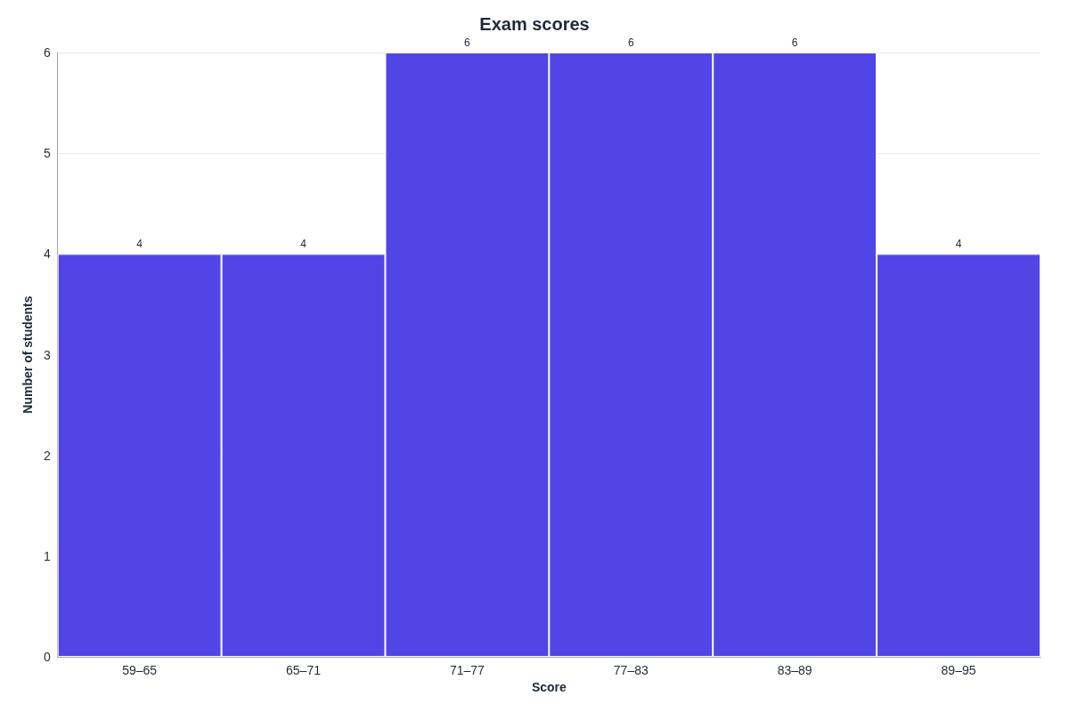
Bins and counts (6 bins)
| Bin | Count |
|---|---|
| 59 – 65 | 4 |
| 65 – 71 | 4 |
| 71 – 77 | 6 |
| 77 – 83 | 6 |
| 83 – 89 | 6 |
| 89 – 95 | 4 |
Each bin includes its lower edge and not its upper edge; the last bin includes both.
The chart is drawn in your browser. Your data is not uploaded or stored.
Runs in your browser
Type or paste your numbers and the chart updates as you go. Nothing is sent to a server.
PNG or SVG
Download a PNG at 1× or 2× for slides and documents, or an SVG that stays sharp at any size.
Same chart from the API
Send the same settings to the API to get the chart as PNG, SVG or PDF from your own code.
Make this chart from your code
This request has the data and settings you see above. The API draws the chart on our servers with the same chart code and returns a PNG; set format to svg or pdf for those files. A chart costs 1 credit, plus 1 credit for each 5 MB of file after the first 5 MB.
curl -X POST https://api.aiipworld.com/v1/jobs \
  -H "Authorization: Bearer $AIIPWORLD_API_KEY" \
  -H "Content-Type: application/json" \
  -d '{"op":"chart_render","params":{"type":"histogram","title":"Exam scores","x_label":"Score","y_label":"Number of students","show_values":true,"data":{"values":[62,71,85,90,77,68,74,88,93,59,81,76,70,84,66,79,91,73,87,64,80,75,69,83,95,72,78,86,61,82]},"format":"png","pixel_ratio":2}}'

# returns {"job_id": "...", "status": "queued", "credits_reserved": 1}; then poll:
curl https://api.aiipworld.com/v1/jobs/JOB_ID -H "Authorization: Bearer $AIIPWORLD_API_KEY"
In one sentence
A free online histogram maker that groups a list of numbers into equal-width bins, draws the histogram in your browser and downloads it as PNG or SVG.
Key facts
- Bins: Sturges' rule by default (ceil(log2 n) + 1 bins), or 1 to 100 bins, or a bin width, with an optional start; each bin includes its lower edge, the last bin both edges.
- Up to 10,000 numbers; a table under the preview lists every bin with its count.
- Example: 30 exam scores give 6 bins of width 6 from 59 to 95 with counts 4, 4, 6, 6, 6, 4.
- Drawn in the browser with Apache ECharts; the data is not uploaded.
- API: POST https://api.aiipworld.com/v1/jobs with {"op": "chart_render", "params": <chart>} and an API key returns the same chart as PNG, SVG or PDF; result.stats has the numbers it was drawn from.
- Free in the browser: no sign-up, no limit on the number of charts, no watermark. The API (POST https://api.aiipworld.com/v1/jobs, op chart_render, PNG, SVG or PDF) costs 1 credit per chart.
How it works
- Paste your numbers into the box, or open a .csv, .tsv or .txt file. Commas, spaces, tabs, semicolons or new lines all work as separators.
- Check the preview. It updates as you type. If a value cannot be read, the tool names that value.
- Set the bins. Keep the default, or type a number of bins (1 to 100) or a bin width, and choose where the first bin starts.
- Add a title and an axis label, then pick the size, text size and main colour.
- Download a PNG (1x or 2x) or an SVG.
Example output
How to make a histogram with this Histogram Maker
To make a histogram, you need a list of numbers. Paste them into the box, one value per line, or separate them with commas, spaces, tabs or semicolons. Cells copied from Excel or Google Sheets arrive tab-separated, so you can paste them straight in. The preview redraws as you type.
If the tool cannot read a value, it tells you which one. For example, it says "abc" is not a number. Fix the value and the preview updates. A button puts the example data back. That data is made up, so use your own numbers for a real chart.
What a histogram shows
A histogram groups numbers into bins of equal width and draws one bar for each bin. The height of each bar is the count, which is how many values fall in that bin. The bars touch because the bins cover one continuous range.
A histogram helps you see where most values sit, how spread out they are, and whether the data has gaps or a long tail. The y axis is labelled Frequency unless you type another label.
- Where the values cluster
- How wide the spread is
- Whether one side has a long tail
How the bins are chosen
By default, the tool uses Sturges' rule. It sets the number of bins to ceil(log2 n) + 1, where n is how many numbers you have. For example, 30 values give log2 30, which is about 4.91. Round that up to 5, add 1, and you get 6 bins.
Sturges' rule is a common starting point, but a different number of bins may show your data more clearly. You can change the bins yourself in the next step.
Setting the number of bins, the bin width and the start
You can set the number of bins from 1 to 100. You can also set the bin width instead, and choose where the first bin starts. Bins always have equal width, so the start and width together decide where every boundary falls. The start cannot be above your smallest value; the tool says so if it is.
Try a few settings and compare the shapes. A very small number of bins can hide detail, and a very large number can leave many bins with few values. Values that sit exactly on a boundary follow the rule explained in the FAQ below.
The bin table: counts for every bin
Below the preview, a table lists every bin with its count. You can use it to check the chart against your numbers. You can also turn on the option to show the count on each bar.
The counts always add up to the number of values you entered, because the bins run from the start to your largest value.
- Turn on the count on each bar for a quick read
- Use the table to copy exact counts into a report
Histogram or bar chart?
A histogram shows numbers grouped into ranges, so its bars touch. A bar chart shows separate categories, such as months or products, and its bars have gaps. Use a histogram when the x axis is a number that runs continuously.
If your numbers are already in a spreadsheet, the spreadsheet's own chart may be all you need. This tool is for when you want a chart without a spreadsheet. Copy the cells, paste them here, and download a PNG or SVG. It does not edit or save your spreadsheet.
Download as PNG or SVG
PNG files come at 1x or 2x. The 2x option doubles the pixels, which keeps the chart sharp on slides. SVG is a vector file, so it stays sharp at any size and opens in browsers and vector editors.
You can choose a size of 1200 x 800 (the default), 1600 x 900, 1080 x 1080 or 800 x 600. You can also enter a custom width from 200 to 4000 px and a height from 150 to 4000 px. Both PNG and SVG can have a transparent background.
Histograms from your own code
The API creates the same charts. Send a POST request to https://api.aiipworld.com/v1/jobs with the JSON body {"op": "chart_render", "params": {...}}, and pass your API key as Authorization: Bearer or as x-api-key. The job runs in a queue, so poll GET /v1/jobs/:id for the status and a download link.
Because the web tool and the API use the same chart code, the same settings give the same chart. Output is png, svg or pdf, and PNG can be 2x. Each chart costs 1 credit, plus 1 credit for each 5 MB of file after the first 5 MB. Failed jobs are refunded. The result also returns result.stats, with the bins and counts. The page shows a ready cURL, Node and Python example built from your settings.
Limits and privacy of this Histogram Maker
A histogram takes up to 10,000 numbers, and you can set between 1 and 100 bins. Files over 2 MB are not opened. Numbers must be plain, with no thousands separators, units or currency signs.
Your data is not uploaded or stored. The chart is drawn in your browser with Apache ECharts, an open-source chart library, so nothing is sent to a server to make the chart. There is no sign-up, no account and no watermark on the free tool.
Questions
Is this histogram maker free?
Yes. The web tool is free, with no sign-up, no account and no watermark. The API needs an account and an API key; the Free plan includes 100 credits a month, and each chart costs 1 credit.
How do I make a histogram in Excel?
Select your data, then go to Insert > Insert Statistic Chart > Histogram. This option is in Microsoft 365, Excel 2024, 2021, 2019 and 2016. You can change the bins under Format Axis > Axis Options.
How do you make histograms in Excel without the built-in chart?
Copy the column from Excel, paste it into the box here, and download the picture as a PNG or SVG. This works for older Excel versions, and for anyone without the Histogram chart. The tool does not connect to your spreadsheet.
How do I make a histogram in Google Sheets?
Select the cells, then go to Insert > Chart. In the chart editor, open Setup > Chart type and choose histogram. If you only need the picture, you can also paste the cells into this tool.
How many bins should a histogram have?
There is no single correct number. By default, the tool uses Sturges' rule, which gives 6 bins for 30 values. You can set the number of bins from 1 to 100, or set a bin width instead.
Which bin does a value on the edge go into?
A value on a boundary goes into the bin above it. Each bin includes its lower edge but not its upper edge. The last bin includes both of its edges.
Can I show the count on each bar?
Yes. Turn on the option to show the count on each bar. The table below the preview also lists the count for every bin.
Can I use decimals and negative numbers?
Yes. Plain numbers such as 12, -3.5 or 1e3 all work. Leave out thousands separators, so write 1000, not 1,000.
How many numbers can I paste?
A histogram takes up to 10,000 numbers. Files over 2 MB are not opened, so check the file size before you open it.
Is my data uploaded?
No. The chart is drawn in your browser, and your data is not uploaded or stored. Nothing is sent to a server to make the chart.
Need this in your app or in bulk?
This tool draws the chart in your browser. The API draws the same chart from the same settings on our servers and returns a PNG, SVG or PDF file, so a script or app can make charts without a browser. A free account includes 100 credits a month.